Kids brand development
Red Stone
It was essential the brand was created in partnership and championed equality, diversity and inclusion – in addition to accessible design.
The discovery research had over 3,000 participants, with a lived experience panel consulted at each stage. So, when two brand positioning concepts were tested, we had an extraordinary 95% and 98% of people liking them.
Kids’ new personality is an ‘Opportunity Creator’, brought to life with four new values: Celebrate Individuality, Think Creatively, Work Together and Speak Up.
A new purpose, sense of empowerment and positivity sits at the heart of the brand: ‘When the world says we can’t, kids say we can.’ The brand story has been carefully crafted with a reading age of 11.
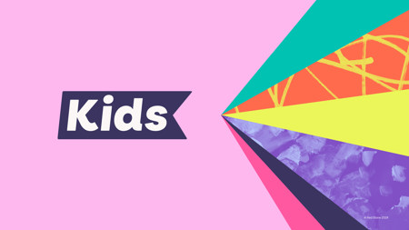
The logo showcases the name in a flag symbol reflecting the ‘K’ for Kids. It’s animated in a colourful and energetic way. To enhance accessibility, we crafted a typeface, ‘Popp Kids’, from the font Poppins, balancing personality and legibility.
One of the most distinctive features are graphic ‘sunburst’ devices, created using children’s artwork – allowing creativity and individuality to radiate throughout.